Well, heres the GUI. . . Its my first time actually making a GUI, I think it turned/is turning out pretty well.
Without further ado. . .
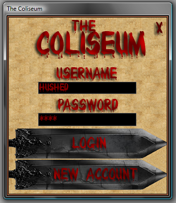
frmMainMenu
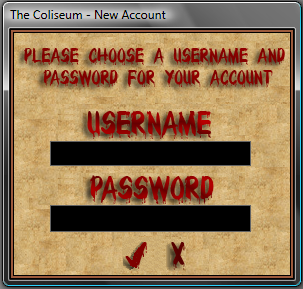
frmNewAccount
Comments, Criticism, anything really.
| Mirage Source http://miragesource.net/forums/ |
|
| The Coliseum - GUI http://miragesource.net/forums/viewtopic.php?f=208&t=2515 |
Page 1 of 1 |
| Author: | Hushed [ Wed Aug 22, 2007 8:21 pm ] |
| Post subject: | The Coliseum - GUI |
Well, heres the GUI. . . Its my first time actually making a GUI, I think it turned/is turning out pretty well. Without further ado. . . frmMainMenu frmNewAccount Comments, Criticism, anything really. |
|
| Author: | Andrew [ Wed Aug 22, 2007 8:23 pm ] |
| Post subject: | Re: The Coliseum - GUI |
Not bad. Get rid of the Vista box around it though. |
|
| Author: | Rezeyu [ Wed Aug 22, 2007 8:37 pm ] |
| Post subject: | Re: The Coliseum - GUI |
It's a screenshot.. |
|
| Author: | Andrew [ Wed Aug 22, 2007 8:44 pm ] |
| Post subject: | Re: The Coliseum - GUI |
Rezeyu wrote: It's a screenshot.. I figured that, but you can still code the gui to not have that Vista box around it. Been a while since I've seen it, but I've definately seen it done before. |
|
| Author: | Rezeyu [ Wed Aug 22, 2007 8:47 pm ] |
| Post subject: | Re: The Coliseum - GUI |
That? You just set Border style to 0 |
|
| Author: | Hushed [ Wed Aug 22, 2007 8:54 pm ] |
| Post subject: | Re: The Coliseum - GUI |
Updated the swords in the first GUI, added the New Account Screen. I just prefer to have the box around it, I like moving my windows around, and I also like to see it at the task-bar, which is why I have the vista box around it |
|
| Author: | Lea [ Thu Aug 23, 2007 2:57 am ] |
| Post subject: | Re: The Coliseum - GUI |
Looks great, but I feel like I have to squint to read the text (im tired right now, and have a bad headache so that probably has something to do with it) Maybe look into making it stand out a little better. |
|
| Author: | Andrew [ Thu Aug 23, 2007 3:17 am ] |
| Post subject: | Re: The Coliseum - GUI |
I could read it fine on my widescreen monitor. In the resolution I'm running now(different computer: 800x600) it seems much more difficult to read. |
|
| Author: | Hushed [ Thu Aug 23, 2007 4:26 am ] |
| Post subject: | Re: The Coliseum - GUI |
Hmm, like is it to small. . . Bad colors. . . Or what? |
|
| Author: | Matt [ Thu Aug 23, 2007 3:02 pm ] |
| Post subject: | Re: The Coliseum - GUI |
It's the shadows and the dark colors of the text that make it blurry for me. |
|
| Author: | Lea [ Thu Aug 23, 2007 3:11 pm ] |
| Post subject: | Re: The Coliseum - GUI |
get rid of the drop shadow, that would probably make it a little better. If you don't want to get rid of it, just lighten it up a lil'. |
|
| Author: | Coke [ Fri Aug 24, 2007 3:10 am ] |
| Post subject: | Re: The Coliseum - GUI |
Haha i really like the feel of it, it doesent look like an amazing new uber proness leetcake but i think it will suit an ms game just fine p.s. d/w that i said it didnt look like an amazing new uber proness leetcake, only person i have ever seen be able to do that is Apk, and hes vanished |
|
| Page 1 of 1 | All times are UTC |
| Powered by phpBB® Forum Software © phpBB Group https://www.phpbb.com/ |
|